The Jakimiec Diagnostic Diagram: Difference between revisions
imported>Hhudson (421 initial upload) |
imported>Hhudson No edit summary |
||
| Line 14: | Line 14: | ||
occurrence in many cases. | occurrence in many cases. | ||
We have estimates of this brightness from 1975 via the | We have estimates of this brightness from 1975 via the | ||
[GOES/XRS] | [https://www.solarmonitor.org GOES/XRS] | ||
measurements, and in limited for earlier than that from | measurements, and in limited for earlier than that from | ||
[SOLRAD]. | [https://en.wikipedia.org/wiki/SOLRAD_10 SOLRAD]. | ||
These basic data give us isothermal fits for the temperature and | These basic data give us isothermal fits for the temperature and | ||
[https://astronomy.stackexchange.com/questions/13429/what-is-emission-measure emission measure] | [https://astronomy.stackexchange.com/questions/13429/what-is-emission-measure emission measure] | ||
of the hot loops that appear in the corona when a flare happens. | |||
Thus we have two simple observable global parameters as functions of time | Thus we have two simple observable global parameters as functions of time | ||
from the basic measurements. | from the basic measurements. | ||
| Line 25: | Line 25: | ||
diagnostic diagram that follows their joint evolution can give hints about | diagnostic diagram that follows their joint evolution can give hints about | ||
the physics involved. | the physics involved. | ||
This idea was elaborated first in Ref. [1], and here we describe how useful it | This idea was elaborated first by Jerzy Jakimiec in Ref. [1], and here we describe how useful it | ||
is even today, some three decades later. | is even today, some three decades later. | ||
| Line 42: | Line 42: | ||
looptop temperature and plasma density. | looptop temperature and plasma density. | ||
Right, the interpretation generalized to illustrate where different | Right, the interpretation generalized to illustrate where different | ||
physical processes apply. | physical processes apply.</i> | ||
]] | ]] | ||
| Line 49: | Line 49: | ||
<ul> | <ul> | ||
<li> Vertical red line: instantaneous heating and temperature increase. | <li> Vertical red line: instantaneous heating and temperature increase. | ||
<li> Horizontal | <li> Horizontal black line: heating in an equilibrium, with temperature constant. | ||
<li> Diagonal blue line: cooling and mass exchange in equilibrium. | |||
<li> Dashed line: adiabatic variation based on RTV scaling (similar). | <li> Dashed line: adiabatic variation based on RTV scaling (similar). | ||
<li> Oblique arrow up: heating and mass exchange during the impulsive phase. | <li> Oblique arrow up: heating and mass exchange during the impulsive phase. | ||
| Line 81: | Line 82: | ||
This is equivalent to the original Jakimiec diagram of 1992, but avoids | This is equivalent to the original Jakimiec diagram of 1992, but avoids | ||
the difficulties of actually inferring an electron density; the emission | the difficulties of actually inferring an electron density; the emission | ||
measure is a direct observable. | measure is a direct observable.</i> | ||
]] | ]] | ||
| Line 103: | Line 104: | ||
recently, and then the complex clockwise pattern during the main phase of | recently, and then the complex clockwise pattern during the main phase of | ||
the flare before its systematic cooling patterns begin.) | the flare before its systematic cooling patterns begin.) | ||
== Note on pronunciation == | |||
For anglophones, the surname Jakimiec of the inventor of the diagnostic diagram we've discussed | |||
would be pronounced roughly "ya key ME ets". | |||
== References == | == References == | ||
Revision as of 21:07, 28 November 2021
| Nugget | |
|---|---|
| Number: | 421 |
| 1st Author: | Hugh Hudson |
| 2nd Author: | |
| Published: | 29 November 2021 |
| Next Nugget: | TBD |
| Previous Nugget: | First look at ALMA/HInode/IRIS microflares |
Introduction
The soft X-ray brightness of a solar flare has come to define flare occurrence in many cases. We have estimates of this brightness from 1975 via the GOES/XRS measurements, and in limited for earlier than that from SOLRAD. These basic data give us isothermal fits for the temperature and emission measure of the hot loops that appear in the corona when a flare happens. Thus we have two simple observable global parameters as functions of time from the basic measurements. One can represent these quite nicely as simple time series, but a diagnostic diagram that follows their joint evolution can give hints about the physics involved. This idea was elaborated first by Jerzy Jakimiec in Ref. [1], and here we describe how useful it is even today, some three decades later.
The diagnostic diagram
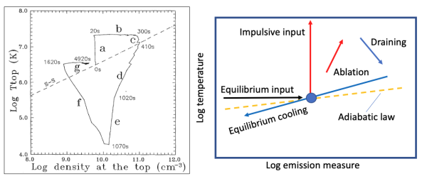
Figure 1 presents the diagram in its original form, intended to illustrate how a simple loop model of a flare would develop in time. Such a model grossly simplifies the possibilities, but indeed such models capture many of the important features of flare development. The richness of this diagram is already clear in the existence of several time ranges with different interpretations, as best understood by looking at Ref. [1] directly.
The sketch in the right-hand panel of Figure 1 shows lines approximating different physical effects:
- Vertical red line: instantaneous heating and temperature increase.
- Horizontal black line: heating in an equilibrium, with temperature constant.
- Diagonal blue line: cooling and mass exchange in equilibrium.
- Dashed line: adiabatic variation based on RTV scaling (similar).
- Oblique arrow up: heating and mass exchange during the impulsive phase.
- Oblique arrow down: draining of initially overdense loops.
Some of these processes have been captured in the convenient EBTEL model of Ref. [2], which takes a step backwards in time and simplicity even from the loop models analyzed in Ref. [1]. Ref. [2] describes why this might be useful, and is a good place to find explanations of some of the processes listed above. Note though that this model is not even a "spherical cow", since a cow has three dimensions as opposed to EBTEL's parsimonious no dimensions at all!
Recent examples
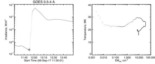
Figure 2 shows a very recent major flare (SOL2017-09-06 X9.3) in the diagnostic-diagram format. This example does not carry the flare through to its return to a preflare equilibrium (the end of the clockwise evolution seen in the left panel of Figure 1, but it does give a precise description of the very onset of the flare via the subtraction of a pre-flare background.

The diagnostic diagram for the 2017 flare shows what we now see as a common property of solar flares, and one not envisioned in 1992 nor captured by EBTEL. This is the "horizontal branch" of the hot onset as described in Nugget No. 392; the diagnostic diagram indentifies this as some form of steady energy input that results in a nearly constant temperature. We do not yet have a good model for how this works.
Conclusion
The great complexity shown by images of solar flares reveal all kinds of dynamic developments, but the energy the flare pumps into the hot coronal loops seems to have relatively simple patterns. These include a steady temperature at the very onset, a sharp increase during the hard X-ray emission (as described in many previous Nuggets, such as No. 403 recently, and then the complex clockwise pattern during the main phase of the flare before its systematic cooling patterns begin.)
Note on pronunciation
For anglophones, the surname Jakimiec of the inventor of the diagnostic diagram we've discussed would be pronounced roughly "ya key ME ets".
References
[1] "Dynamics of flaring loops. II - Flare evolution in the density-temperature diagram"
