Weekly Report 12Nov2010: Difference between revisions
imported>Agopie No edit summary |
imported>Agopie No edit summary |
||
| Line 35: | Line 35: | ||
Both imaging techniques produce an elliptical source around the centroid of the original data map. The Pixon image breaks up into multiple smaller sources at the centroid. Neither method reproduces a symmetrical albedo contribution away from the centroid of the image. This may be due to the low number of counts away from the compact source. | Both imaging techniques produce an elliptical source around the centroid of the original data map. The Pixon image breaks up into multiple smaller sources at the centroid. Neither method reproduces a symmetrical albedo contribution away from the centroid of the image. This may be due to the low number of counts away from the compact source. | ||
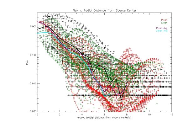
The following plot | The following plot shows the flux as a function of radial distance from the centroid of the source from an image with total counts of approximately 10^4. | ||
[[Image:Flux 301 low avg.jpg |center|thumb|600px|The flux as a function of radial distance from the source centroid. The original map is shown in black dots. The black line represents the average of the flux at a given radial distance. The pixon image is shown in red dots. The purple line represents the average of the flux at a given radial distance. The clean image is shown in green dots. The cyan line represents the average flux at a given radial distance. The total counts in the image is ~10^4.]] | [[Image:Flux 301 low avg.jpg |center|thumb|600px|The flux as a function of radial distance from the source centroid. The original map is shown in black dots. The black line represents the average of the flux at a given radial distance. The pixon image is shown in red dots. The purple line represents the average of the flux at a given radial distance. The clean image is shown in green dots. The cyan line represents the average flux at a given radial distance. The total counts in the image is ~10^4.]] | ||
Looking at the plot above the pixon image is more compact around the centroid of the source. The clean image contains multiple bumps, but they seem to be outliers that do not affect the overall average of clean profile greatly. The look like artifacts. I don't think we can say that either method is imaging the albedo. | |||
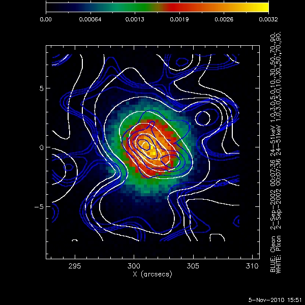
The following shows the clean and pixon images for an image with total counts of approximately 10^5. | |||
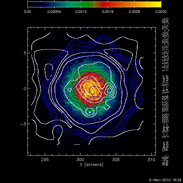
[[Image:Clean pixon middle counts.jpg|center|thumb|600px|The above shows the original data map(background image), the clean contours (Blue), and the pixon contours (White), for ~10^5 total counts in the image.]] | [[Image:Clean pixon middle counts.jpg|center|thumb|600px|The above shows the original data map(background image), the clean contours (Blue), and the pixon contours (White), for ~10^5 total counts in the image.]] | ||
The clean and pixon images both are approximately the size of the compact source. The 3% and 5% contours are both at the very edge of the source. However the 1% contour for clean is clearly defined while the same contour for pixon is in the statistical noise. At this number of total counts clean seems to find structure down to the 1% level. Pixon has a higher flux much farther away from the compact source, this may be an artifact of being at the edge of the image. | |||
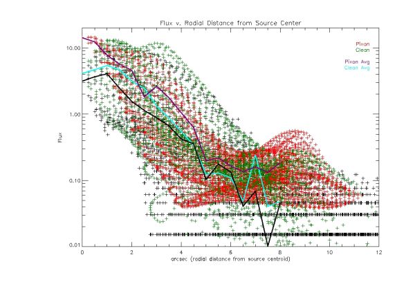
The following plot shows the flux as a function of radial distance form the centroid of the compact source for an image with approximately 10^5 total counts. | |||
[[Image:Flux 301 mid avg.jpg|center|thumb|600px|The flux as a function of radial distance from the source centroid. The original map is shown in black dots. The black line represents the average of the flux at a given radial distance. The pixon image is shown in red dots. The purple line represents the average of the flux at a given radial distance. The clean image is shown in green dots. The cyan line represents the average flux at a given radial distance. The total counts in the image is ~10^5.]] | [[Image:Flux 301 mid avg.jpg|center|thumb|600px|The flux as a function of radial distance from the source centroid. The original map is shown in black dots. The black line represents the average of the flux at a given radial distance. The pixon image is shown in red dots. The purple line represents the average of the flux at a given radial distance. The clean image is shown in green dots. The cyan line represents the average flux at a given radial distance. The total counts in the image is ~10^5.]] | ||
The most noticeable effect of adding counts to the image is the spread of the flux at any given radial distance is smaller. This is encouraging since we know the image is symmetric around the center of the compact source. There are also peaks which show up in the Pixon profile away from the center which may be evidence of the albedo, as they have an effect on the average of the profile at a given radial distance. The discouraging aspect is these peaks do not seem to be present in the average of the profile of the original data map. | |||
The following shows the clean and pixon contours for an image with approximately 10^6 total counts. | |||
[[Image:Clean pixon high counts.jpg|center|thumb|600px|The above shows the original data map(background image), the clean contours (Blue), and the pixon contours (White), for ~10^6 total counts in the image.]] | [[Image:Clean pixon high counts.jpg|center|thumb|600px|The above shows the original data map(background image), the clean contours (Blue), and the pixon contours (White), for ~10^6 total counts in the image.]] | ||
Once again in this case both imaging methods do a reasonable job of reproducing the compact source although neither is symmetric. Once again clean seems to do a better job of imaging the edges of the source, while pixon breaks up for the 3% and 1% contours. Does pixon need to use detectors with coarser grids to image the extended source accurately? | |||
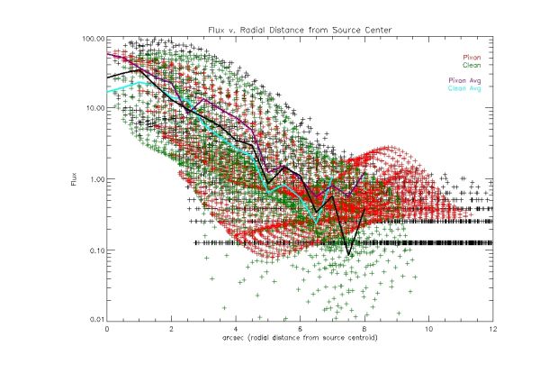
The following plot shows the flux as a function for radial distance from the centroid of the compact source for an image with total counts of approximately 10^6. | |||
[[Image:Flux 301 high avg.jpg|center|thumb|600px|The flux as a function of radial distance from the source centroid. The original map is shown in black dots. The black line represents the average of the flux at a given radial distance. The pixon image is shown in red dots. The purple line represents the average of the flux at a given radial distance. The clean image is shown in green dots. The cyan line represents the average flux at a given radial distance. The total counts in the image is ~10^6.]] | [[Image:Flux 301 high avg.jpg|center|thumb|600px|The flux as a function of radial distance from the source centroid. The original map is shown in black dots. The black line represents the average of the flux at a given radial distance. The pixon image is shown in red dots. The purple line represents the average of the flux at a given radial distance. The clean image is shown in green dots. The cyan line represents the average flux at a given radial distance. The total counts in the image is ~10^6.]] | ||
Once again, around the compact source the spread of points is tight for bot the pixon and clean images. As we get farther away from the centroid, the clean image falls off like the original data map, the pixon image however levels up, with a much higher flux farther out from the centroid. There is a sharp rise in the pixon profile at approximately 2.5 arcsec from the center of source, but the shape of the profile changes so significantly it may be an artifact. | |||
Revision as of 02:39, 16 November 2010
Pixon Albedo Imaging Results
Using Eduard Kontar's simulated eventlist files, Pixon Images were created for a compact circular gaussian source with an albedo near disk center, and near the limb. The following parameters were used for each image:
- Time: 2-Sep-2002 00:07:36 - 00:08:16
- Energy 24keV - 51keV
- Detectors 1 t0 4
- Image Size: 64 by 64 pixels
- Pixel Size: .5 arcsec by .5 arcsec
In each Image below the following convention was used:
- Background Image: The original data map supplied by Eduard Kontar
- Blue Contours: The Clean Image Contours
- White Contours: The Pixon Image Contours
The Contours levels used were: 1%, 3%, 5%, 10%, 30%, 50%, 70%, and 90%.
The plots below each image show the flux of a pixel as a function of the distance from the centroid of the source. It is a modification of looking at the flux along a single line through the image. In this method every pixel is plotted so the entire image can be viewed. The following conventions were used in all radial profile plots:
- The values of the flux for the original data map were 'normalized' such that the peak value matches the peak value of the Pixon images
- The flux values for each pixel in the original data map are black points
- The flux values for each pixel in the Pixon image are red points
- The flux values for each pixel in the Clean image are green points
- The average value of the flux at each radial distance in the original data map is represented by the solid black line
- The average value of the flux at each radial distance for the Pixon image is represented by the purple line
- The average value of the flux at each radial distance for the Clean image is represented by the cyan line
Simulated source closer to disc center(X = 301 arcsec, Y= 0 arcsec)
The following images and plots of the flux are for the simulated source near the disc center.
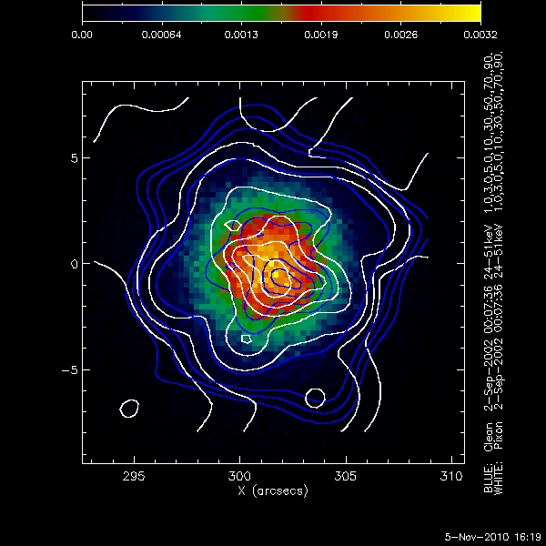
The following image is for the source near disc center with the lowest number of total counts, approximately 10^4.
Both imaging techniques produce an elliptical source around the centroid of the original data map. The Pixon image breaks up into multiple smaller sources at the centroid. Neither method reproduces a symmetrical albedo contribution away from the centroid of the image. This may be due to the low number of counts away from the compact source.
The following plot shows the flux as a function of radial distance from the centroid of the source from an image with total counts of approximately 10^4.
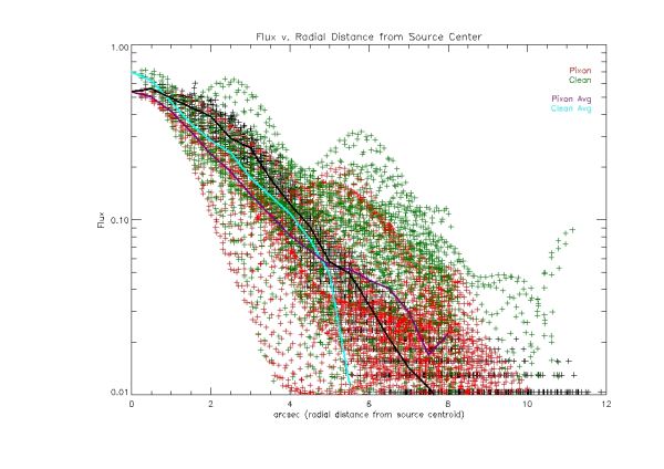
Looking at the plot above the pixon image is more compact around the centroid of the source. The clean image contains multiple bumps, but they seem to be outliers that do not affect the overall average of clean profile greatly. The look like artifacts. I don't think we can say that either method is imaging the albedo.
The following shows the clean and pixon images for an image with total counts of approximately 10^5.
The clean and pixon images both are approximately the size of the compact source. The 3% and 5% contours are both at the very edge of the source. However the 1% contour for clean is clearly defined while the same contour for pixon is in the statistical noise. At this number of total counts clean seems to find structure down to the 1% level. Pixon has a higher flux much farther away from the compact source, this may be an artifact of being at the edge of the image.
The following plot shows the flux as a function of radial distance form the centroid of the compact source for an image with approximately 10^5 total counts.
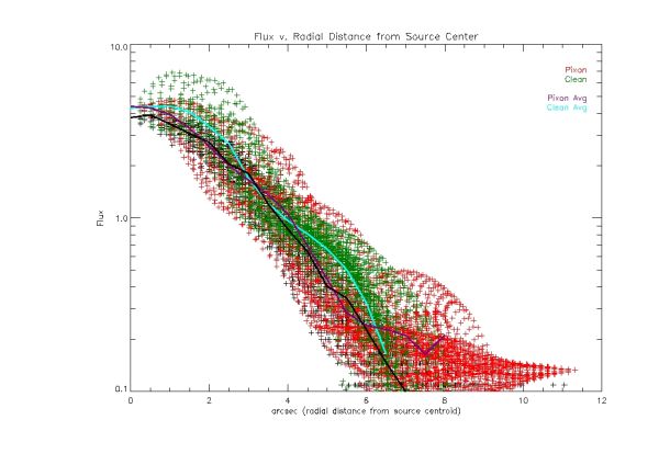
The most noticeable effect of adding counts to the image is the spread of the flux at any given radial distance is smaller. This is encouraging since we know the image is symmetric around the center of the compact source. There are also peaks which show up in the Pixon profile away from the center which may be evidence of the albedo, as they have an effect on the average of the profile at a given radial distance. The discouraging aspect is these peaks do not seem to be present in the average of the profile of the original data map.
The following shows the clean and pixon contours for an image with approximately 10^6 total counts.
Once again in this case both imaging methods do a reasonable job of reproducing the compact source although neither is symmetric. Once again clean seems to do a better job of imaging the edges of the source, while pixon breaks up for the 3% and 1% contours. Does pixon need to use detectors with coarser grids to image the extended source accurately?
The following plot shows the flux as a function for radial distance from the centroid of the compact source for an image with total counts of approximately 10^6.
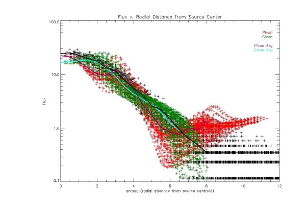
Once again, around the compact source the spread of points is tight for bot the pixon and clean images. As we get farther away from the centroid, the clean image falls off like the original data map, the pixon image however levels up, with a much higher flux farther out from the centroid. There is a sharp rise in the pixon profile at approximately 2.5 arcsec from the center of source, but the shape of the profile changes so significantly it may be an artifact.
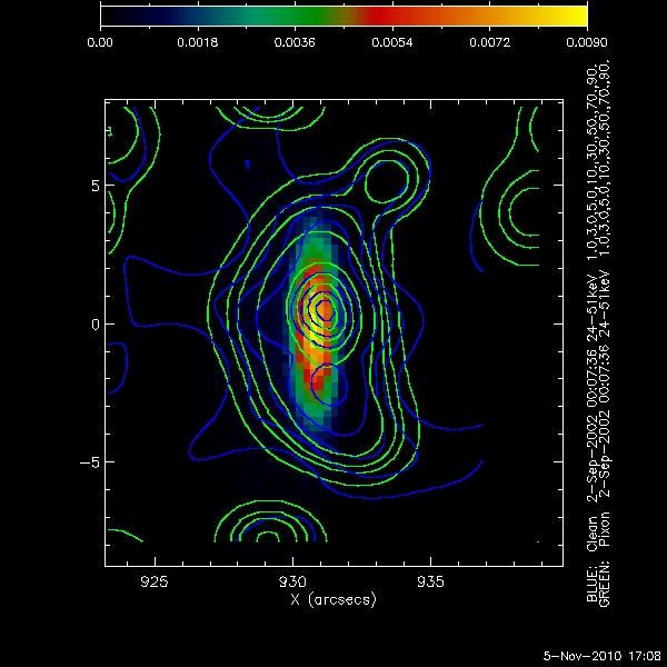
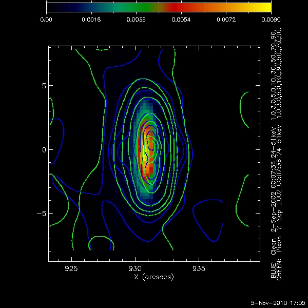
Simulated source near the limb (X = 930 arcsec, Y = 0 arcsec)
