Homing in on Flare Energy
| Nugget | |
|---|---|
| Number: | 223 |
| 1st Author: | Hugh Hudson |
| 2nd Author: | Ryan Milligan |
| Published: | April 14, 2014 |
| Next Nugget: | TBD |
| Previous Nugget: | Empirical Constructs and Cartoons |
Introduction
We often want to represent the distribution of energy in the spectrum of an astronomical object, such as a solar flare. An energy spectrum can have many representations; two common ones are fλ (in CGS, with wavelength units) ergs/cm2 s A, or Fν (in SI, with frequency units) W/m2 s Hz. Needless to say, a profusion of other forms exists, often tailored to a specific kind of observation, and there is much nuisance involved in making comparisons. In flare physics this now has become very interesting, owing to the big breakthrough in Ref. [1], in which the total radiant energy of a solar flare could be determined bolometrically. Now the question is, where within the spectral energy distribution does a flare choose to put this energy? With modern broadband data such as those from [SDO], we are now homing in on the answer to this long-standing question.
This Nugget explains a frequently-used stratagem for a quick visual overview of heterogeneous data. The basic trick is just to note that the energy, in whatever units, is the simple integral of the spectral energy (ie, per unit bandwidth). Thus fλdλ and Fνdν both are simply energy or power, with suitable adjustments between the cgs and MKS (or other) representations. We realize that everybody understands this, and yet the Nuggeteers here have often confused themselves on this score, hence the Nugget.
Why λfλ? Or νfν?
Because of Equation (1) here. This shows that if one plots this quantity on a linear-logarithmic basis, equal areas must have equal energies (or power levels, if the quantities are differential in time as well as bandpass). One can mix and match any spectral form here and obtain a correct representation.
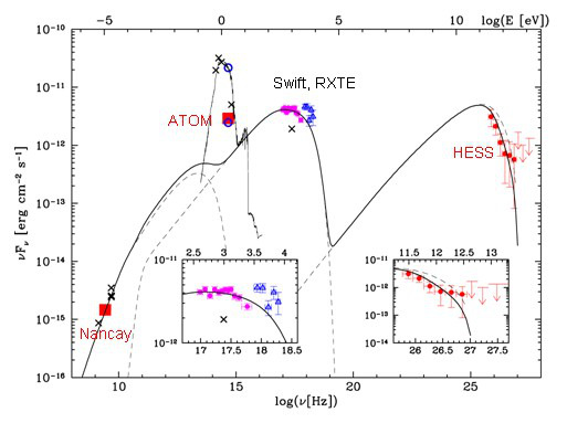
This kind of representation is often used in non-solar astrophysics, where one may have skimpy data at wavelength (or frequency ranges) very distantly scattered across a spectrum many decades wide. An example appears here in Figure 1, taken from a page describing results at TeV energies that need to be compared with meter-wavelength radio data. This plot combines [Nancay] and [HESS] data at the extremes, with other information in between.

We do not often have to describe such greatly extended energy distributions in solar flares, but of course they do appear all across the wavelength range. for example, the thermal free-free spectrum seen by GOES and in thermal microwave emission underlies the whole spectrum from 1 A to 10 cm.
The case of the solar flare
A solar flare concentrates its radiant energy near the visible/UV range, but with much broader extensions at both extremes of the spectrum. The flare spectrum is broadband, but how much actual energy is in the extremes? The λfλ plot shows us immediately, or at least points directly to our ignorance, and therefore should be taken seriously as a tool for planning future observations.
